Wednesday, October 10, 2012

Shot-by-Shot Scene Analysis of a Moment in Mad Men


For my scene analysis, I've chosen a scene from Mad Men season 3, episode 3 entitled, "My Old Kentucky Home." Mad Men is of course a TV show on AMC set in a 1960's American advertising agency. This scene is set in the home of Joan, a secretary from that agency, and her husband Greg. Greg has invited some of his medical colleagues and their wives over for dinner. He expects not to be embarrassed in front of them, and for Joan to be a perfect, entertaining host. This scene centers around Joan's reactions to her husband's behavior. In the three minutes (and 58 shots) that the scene lasts, the message is communicated that Greg puts Joan into situations to do things that she does not want to do and is extremely proud, and yet that Joan is aware of these moments where he uses her as a trophy and is perfectly capable of calling him out for it. You can watch the full scene on instant netflix if you have it, or the majority of the scene here on youtube. (the acting is amazing!) 


SCENE ANALYSIS

There are 58 shots in total in this scene, I tried to speak to each camera setup at least once, so that explains why there are sections where I haven't said anything. Keep on scrolling through til the end to read everything!


The first shot of the scene is a medium two shot of Joan and another woman in Joan's apartment. Because Mad Men uses multiple protagonists to tell multiple stories in each episode, this shot immediately establishes for the regular Mad Men viewer that it's Joan time and that the focus will be on her.

The next shot establishes more of Joan's company

This is the widest angle of coverage in the whole scene and establishes a full view of the room. The perspective of being on the outside of the circle looking in creates a sense of distance and outsiderness that is relevant to Joan's feelings in this scene, as she is an outsider to the conversation taking place between her husband and his colleagues. This is also the first shot that shows her husband, Greg.


Greg's first medium shot show him places solidly in the frame, occupying a good amount of space. His dominance in the frame will come to match his domineering behaviors as the scene progresses. This over the shoulder shot is also meant to match eyelines with the next shot of Joan.

Greg's shoulder intrudes much more into Joan's frame than the shoulder entering Greg's frame above. This makes her appear much slighter, intruded upon, and much more gazed upon. This is appropriate because Joan is under observation by the entire group for the duration of the scene. All eyes will come to be on her as she is expected to perform.

It is revealed through dialogue that this is Greg's boss. He is given a lot of importance and boss-man space allowance in the frame.

This three shot that is used often in the scene communicates so much about Joan's relationship to these visitors to her home. She is placed on the edge, as far from the middle of the group as she can be, and in such a position that she has to crane and twist her body in order to be participatory in the conversation. She is smaller, and more distant. She is not on the same level as everyone else both physically in the frame and with regards to the story as she is an outsider to their world.


This wider version of the three shot includes the boss as a framing device. This alters the perspective in that the audience is made more aware of his gaze and point of view. This gives him importance and the feeling of being able to judge the others.


As it is revealed that Greg has not been telling Joan about things that have been happening at work, the shots get tighter as the tension grows. As Greg begins to get nervous and antsy, we get to see more of those emotions read up close on his face. Likewise for Joan's reaction shot a few shots later.


The first medium close up of Joan comes right as the emotion of the scene calls for it and things are beginning to become suspicious. This shot shows Joan wondering why Greg keeps things from her, and its use heightens the connection between the audience and Joan by finally bringing us closer to her when the other shots so far have kept us at a distance. This shot brings you into Joan's head at last.


At the height of Greg's dominance in the storyline, he become huge in the frame. He's looking down on Joan when he speaks to her, and the shot communicates this by being close to Joan's point of view looking up at him.

Meanwhile when it cuts to Joan we are kept right on her level. This makes us more sympathetic to her plight because we've been set up visually to identify more with her perspective. Having Greg literally hold something over her in the frame as she looks up with him creates again the sense of intrusion. We're watching him ask her to do something she doesn't want to do, and the frame reflects this feeling of forcing something upon someone.

Greg just looks super imposing here. The lines leading to his head even make the frame feel like there's no escaping him. He just fills the space up with his presence. And there's the way he's blocking out light that's radiating from behind him and casting shadows on the walls. There is just no escaping him at this point. Though Greg's dialogue reads like he's asking for a favor, this visual implies that he's telling.  This and the preceding close-up are really what let the audience know that there is a subtle interpersonal struggle happening between the two of them. Their dialogue really does not speak to it so much as their body language and the composition of these shots.

Joan's body pointing away from Greg in another direction makes it feel even more like she just does not want to do what he's asking her to do. And again, Greg's body as a frame is pushing and imposing upon her.

They then cut to the other couples looking really awkward to open the space and remind you that this tight, intimate tension between Joan and Greg is actually happening in public in the company of other people.

This is the first and only shot in which you're allowed to see Joan and Greg's faces in the frame together and it comes when he is handing her her accordion to perform and entertain when she does not want to. This image lets the audience know that he's forcing it upon her, even though their dialogue alone has seemed relatively polite.

Greg being imposing all over the place with everybody, not just Joan. He's forced them all into this uncomfortable tight space.

The small glimpse of Joan's body sharing the frame with everyone looking at her visually communicates that she is being observed closely. 


It becomes obvious that Greg is trying to impress his boss by using his wife as a trophy. His standing behind the seated boss shows him as controlling to Joan and yet accountable to his more important boss.

This shot communicates the feeling of gazing at Joan, as all the other characters are.


Boss man getting importance in the frame again, which cuts to...

Imposing Greg standing behind him looking satisfied...

Matching Joan standing but filling the frame much less, with all the space around her creating the feeling of isolation that she must be feeling.


Meanwhile these folks look delighted, cheesy and oblivious to the drama


And this shot is the crux of the whole scene to me. The idea of the preceding shots of the other couples signifying them being oblivious to the interpersonal drama between Joan and Greg are verified here. This action of Joan giving Greg an amazing "How dare you" look is covered in close ups of the two of them. This really is just between the two of them. This is the closest shot of Joan in the scene and conveys all of her emotion, and her true disdain for Greg in the moment. All of the wider shots of her performing have showed her smiling and playing along, but as soon as we get this close up, we become privy to a view of her that only Greg is seeing, and there are no smiles.

We can be sure that the information in Joan's close up that we're seeing is only seen by Greg in the scene by the way they alternate these two close ups to show Greg's reaction to the fierce look she gives him.

Still fierce. And this proximity to Joan is the only time we see her straight on, not from an outside angle, with no one else being used framing device, and with full light in her eyes (which seem to be a little watery). This angle conveys truth. Because we can see her full on, we know that this must be the truth of Joan and her perspective. The other shots communicate the persona she's putting on for show, but this close up tells us what she's really thinking.

And then we finish back out at a distance in a wide, reminded that Joan has had to do this all to entertain others at the forcing of Greg, who stands watching it all at the edge of the frame, still being imposing. 

So there it is. I just love Mad Men and this scene is really, really well done. They manage to do the expected theme of 1960's patriarchal, strict husband crushing his wife's spirit and make it not so expected. The connection they can make the audience forge with Joan with how they cover this is amazing.  


Thursday, September 27, 2012

Portrait of a Place

TCF 312 - Portrait of a Place - Railroad Park from UA, Telecommunication and Film on Vimeo.

This portrait tells the story of a day at Railroad Park.
I am trying to communicate the feeling of observation, exploration, and momentum of the park from a kid's perspective by placing the kids in the frame in such a way that shows their relative size to the giant city structures, by having movement throughout the frame so that the nature of the railroad is reflected in the kids busy activity in the park, and by using music that sounds like curiosity, groove, and exploration.

Tuesday, September 25, 2012

Reflections


(suggested listening for as you read this post, my favorite music for having introspective reflection moments to!)

I've really enjoyed learning the specifics of different cameras. Reading the manuals and then going hands on immediately after has been just what I needed. I feel much more comfortable picking up the available cameras and working with them quickly and efficiently, knowing where the things I need are located physically on them. I've also expanded what I know about filters, specifically the polarizer. I think I'm realizing that my strengths lie on the side of direction and composition. DPing is sometimes challenging in that I just still don't feel like I'm as quick at it as I want to be yet. My directing brain knows where it wants to go much faster than my DP brain knows how to get there. I'm continuing to work on expanding the way I think about the technicalities of light. It is rewarding to just get more experience and know that I am getting faster at picking things up.

Tuesday, September 18, 2012

Light


Obama - Nadav Kander


Mad Men

The Girl with the Dragon Tattoo

Andrezj Dragan


Where the Wild Things Are

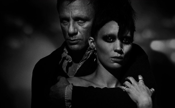
I like to look at catch lights in eyes for what they add to images of people. They instantly create a depth and connection to the subject that wouldn't be the same if they were missing. The portrait of Obama is powerful because in adition to catching him in an angle we're not used to seeing, there is so much light in his eyes. The absence of light in a photo like this might subconsciously associate a person with a darker personality type, but of course with the light there we're reminded of innocence and purity. The same goes for the portrait of the old man by Andrezj Dragan. He uses a similar technique in much of his work that highlights the eyes in this way. This idea is also at play in the promo still from The Girl with The Dragon Tattoo. As we can see more light in Rooney Mara's eyes and less in Daniel Craig's it creates potential to interpret him as more evil, especially including the way they are positioned. I like the photo from Mad Men as a cool use of chiaroscuro technique, and the Where the Wild Things are landscape as an opposing saturation of light with more bright than dark.  

Tuesday, September 11, 2012

Filmmaking Goals

It always bugs me that google thinks the word "filmmaking" is spelled wrong.
It occurred to me only just now that I should add the word to my dictionary and make it stop.

It's hard not to become overwhelmed when I think about my long term goals as a filmmaker. This is because I legitimately want to do a bit of everything. I want to be as fully self-sufficient as possible in the process. I definitely do not expect to become an expert in everything with this goal, but I want to be capable of jumping in anywhere in the start to finish life of a film or tv show and knowing exactly what I want to happen. Music videos, feature length fiction films, shorts, documentaries, television programs....I really and truly do want to be able to work on a variety of projects over the course of my career. I have always wanted to work on a long-running, hour-long, single-camera, comedy/drama tv series. I just love those. I want to get to a point where I can do different styles, all the while developing my own signature. Whatever I end up doing, I know that I want to work on projects which give media representation to underrepresented groups. Being a queer, black, southern, lower middle class, female-identified kid....I definitely know what it feels like to not always feel represented by the media. And that lack of representation counts for so much more than I think people realize. I mean I watched any and all TV I could get growing up. I had my own subscription to tv guide when I was around 11 - (and I collected all of them on top of that, so I still have a giant Rubbermaid of tv guides from the early 2000s in storage somewhere).
(I probably have this issue from 2000 saved somewhere. Don't get me wrong, I loved 'N Sync dearly, but I wish I had realized what was really going on with the media's idolization of white, cis-male, straight boys in expensive clothes. There's plenty of that on TV. I don't need to add to it. Sidenote: I do want some of my work to be on TV Guide cover sometime though!)

 I watched so much tv and yet it never occurred to me until I was much older what was missing and how that influenced my thinking on what (and who) television and film considered to be valuable. So I'm definitely going to tell stories that feature people and characters that are living truths that need to be shown in the media more. I want those voices in every project I do.

My learning goal for this course in particular is to become much more comfortable picking up and using any camera immediately. I want to get better with articulating lighting technique. I definitely want to become faster in how long it takes that articulation in my head to get to my mouth, and then ultimately to my hands. I really need to immerse myself in learning how to be faster about remembering how focal length, zoom, iris, etc. will immediately affect the look of any given shot. I feel like I just take too much time thinking about it now. I want to learn more efficient/organized workflow. And a lot of other things I'm sure I can't even explain right now!

Thursday, August 30, 2012

Visual Style

I'm trying not to post a million pictures in this post, but I might not be able to help it. We'll see.
These are some of the images that have really hit me as visually striking.

Whenever I think of a movie that I really loved/would like to emulate the look and feel of I go to Hard Candy first. Warning that the subject matter is uncomfortable. This is a 2005 film which focuses on "the torture of a sexual predator by a 14-year old vigilante Hayley Stark, portrayed by Ellen Page." (i let wikipedia word that for me). The idea behind the film was to take the image and story of little red riding hood being preyed on by the wolf and flip it so that little red became the predator. KICKASS IDEA RIGHT?! I love the plot of this movie, but the look of it is what makes it so remarkable. This movie is one of few where the colorist (Jean-Clement Sorret) has been listed in the opening credits of the film. Here's why:

  • "The film contains many coloring effects and “density shifts” of lighting to reflect the moods of the characters. For example, when Hayley gets angry the colors would be edited to be of lower frequency.One effect used which, as far as the director is aware of, had not been done in cinema before, was to brighten the lighting in filming and recorrect everything down in post-production.This allowed for facial details to be visible even while having a darkened atmosphere. The process required a custom-built digital intermediate to be made and proved to be extremely difficult, with corrections having to be made frame-by-frame in some instances." (wikipedia)


The use of color and light to indicate tone is beautifully executed.
They use a lot of solid color walls which fill the frame richly with unyielding backdrops. Red and blue are often used for anger vs. calm. In one scene where the sexual predator has a blatantly honest monologue about his past, the wall behind him is a pale pink that almost perfectly matches his skin tone - a visually enhanced reminder that he's human.


I can't say enough about how cool this film looks. I'm including the trailer because I think it should be seen in motion. (again, the subject matter my be triggering.)

I feel like these next references are a genre but I'm not sure how to classify them. I guess they're realistic-drama-comedies-geared towards weird young-adults? I'm linking these together because I like them for their realism, interesting two shots, spacious outdoor shots, and understated uses of color.
Away We Go (2009)


Juno (2007)

Napoleon Dynamite (2004)

Alternate Reality:
Scott Pilgrim vs. The World (2010)
I adore this movie. They used so many special effects to bring it to life. This still is from the amazing opening sequence. In the movie, a small living room appears to stretch as the band plays louder and louder. They constructed this elongated set and did a sophisticated pull to achieve the stretch look. The DVD has four separate commentary tracks that I highly recommend! The cast and crew go into great detail to explain how the effects and complicated shots were done.

TRON: Legacy (2010)
In this Tron update from 2010, pretty much everything on screen is a digital effect. The costumes and sets were built with expansive light tubes which were then enhanced digitally to give the film its signature glow. I love how they created an entire luminous world. The attention to detail here draws the eye into a full alternate reality.

Seven Nation Army -music video for The White Stripes (2003)
This music video is iconic for its use of shape and dimension. The viewer is sent through repeating triangle shapes of the band and their signature red and white colors.

Lose Control - music video for Missy Elliott (2005)
I don't think anything says "alternate reality" like a Missy Elliott video.

Two big television influences:
Lost - Emmy award nominated DP Michael Bonvillain 
The crew achieved amazing visuals while constantly navigating difficult terrain.

Mad Men 
Mad Men just kills me with how gorgeously on point it is sometimes.

Outside of video:

Lomography:
Before instagram, there were good old Diana cameras. I've always wanted one. I don't know why I just haven't gotten one by now, maybe I will soon. The way these plastic cameras get all haphazard with light is often times dreamlike and stunning. You just have to commit to liking the lack of control.

Monet:
There was an art teacher at my elementary school who was obsessed with Monet. We had Monet absolutely everywhere. I still like it, I don't know if it's more to do with childhood memory or the style in general. I'm interested in how to achieve impressionism in video. The diana camera also gives me the same sense of impressionism actually. I SWEAR I'M NOT PRETENTIOUS. It's just that Monet can hang.

Banksy:

Banksy's massive displays of broken reality are fantastic. Exit Through the Gift Shop was pretty cool too.

Byrogliphics: 
 Byrogliphics is this painter that I really like. Again, it's a color as emotion, impression, weird layered dimension sort of thing.
I guess that last part is how I might sum up my own visual style goals for the moment. But of course that is subject to change.
Sorry for rambling!